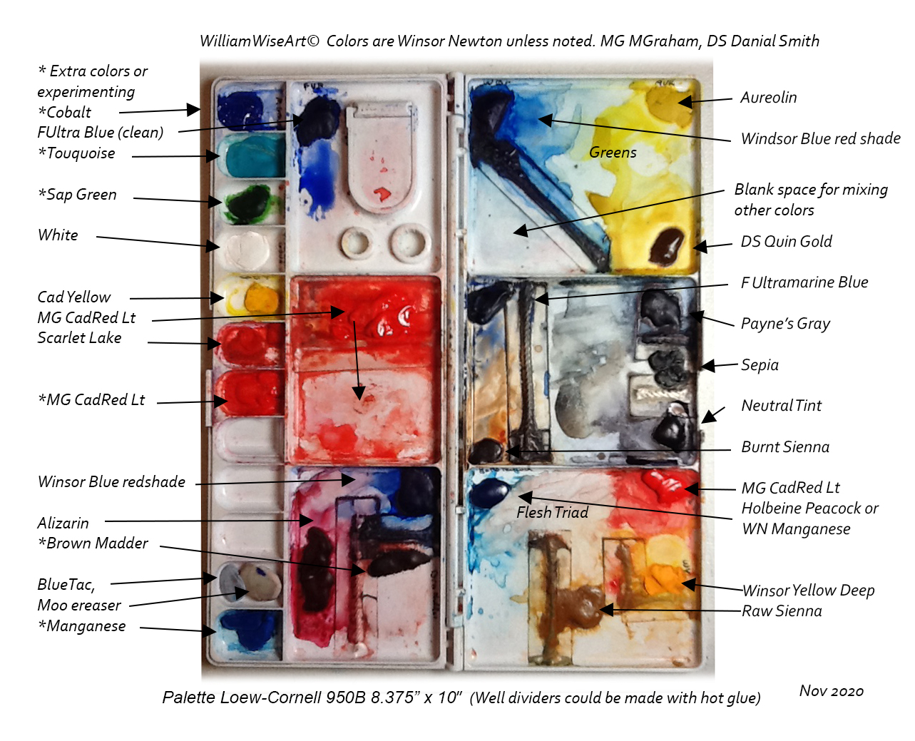
Below are my recommended flesh colors and my small portrait palette (updated Mar 2022.) The brands used are Winsor Newton (WN) if not otherwise specified. Check out my YouTube page ‘William Wise Art’ for demos.
Note below I refer to different values as #9, 8 and 7 etc. Search for a “Gray Scale and Value Finder”. This numbering is standard and you can find these scales everywhere you buy supplies. Blick sells them for around $3.
I’ve been using M.Graham’s (MG’s) Cadmium Red Light as my primary flesh red. Cadmium Red is an opaque watercolor paint, and sits on top of the washes below. Scarlet Lake is more staining so it is harder to lift.
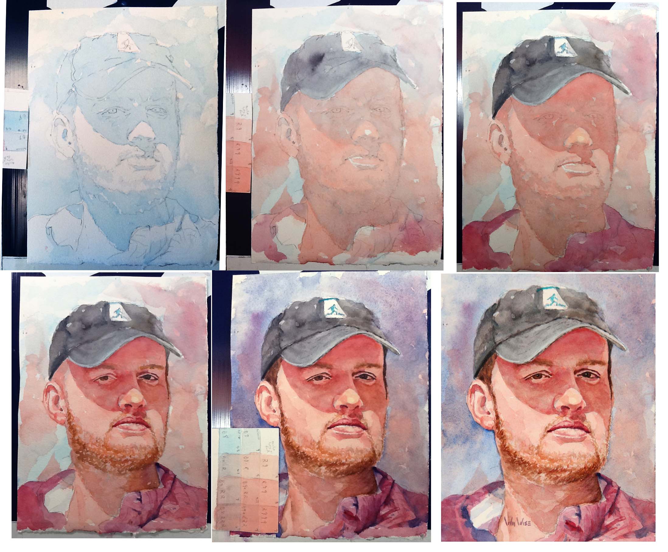
Logan progressive washes
Follow along with the little reference value card in 1st, 2nd, and the 5th photo.
Photo #1: The first base wash on face was WN Manganese Blue value #9 (on standard Value Scale cards). It covered everything but the light areas (cheek and nose). This makes a monotone base painting and makes the dark layers glow. (I was testing Holbein’s Peacock blue)
#2: The next layer was the first wash of MG Cadmium Red Lt over the whole face (except highlight on nose and lip) and also into the background (immediately connecting the subject to the background). Both the blue and the red were a value #9 mix. (See side strip). This is the lightest area on the cheek (red over white paper = a value #9).
#3: The next wash was the same value red on the shadow. (Two layers of the same #9 value Cadmium Red on top of blue = a value 7. Look at your value scale and photo #5).
#4: Next was the mouth, nose, eyes, and ears with Alizarin and other warm darks. That completes about 50% of the face.
#5: Now you model the rest of the portrait with more layers and other common colors in order to add interest. His hat is a combination of Neutral Tint, Sepia, and probably Payne’s Gray. Keep blending and floating your colors for interest (don’t over mix!!!). Blend each color you use into the background as you go.
#6 Finished
- My 2020 (portrait) palette in order of priority and use:
Primary flesh colors. (Great flesh triad) Manganese Blue, MG’s Cadmium Red Light, WN Windsor Yellow Deep, plus maybe some Raw Sienna. Blends go from light to dark skin. Mix these colors to match the back of your hand!! I use Scarlet Lake at the very end to add warmth to cheeks. (I have been experimenting with Holbein Peacock as a substitute for Manganese Blue. Peacock seems less granular and less opaque, but the same color.)
Brown/red Hair, rusty browns, warm darks: The classic – French Ultramarine (FU) Blue, Burnt Sienna (BS) (I’m primarily use Daniel Smith’s (DS’s) Quinacradone Burnt Orange as sub for BS),
Blond hair is Raw Sienna RS in light areas, then add the mix above of FU and BS to make it darker in shadows. (Yellow Ocher is more opaque then RS)
Darks on face: (Lips, nostrils, corners of the mouth): Alizarin, Winsor Blue Red Shade or FU, with the Cadmium Red.
Eyes: Use all of the above colors, but lean toward the warms and always keep the color changing. The same color throughout the lid is boring!
Greens and cool blues: (These are my current favorite base background. They are a complement to flesh colors.) Winsor Blue Red Shade, DS’s Quinacradone Gold, Aureolin. Never wait to start the background – every time I have one color on my brush, I stroked it into the background. Paint outside the lines of the face knowing the background will be darker than the cheeks!
Very darks (warm and cool): I blend these 3 together and seldom use alone: Payne’s Gray, Sepia, Neutral Tint.
Reminder: brands are Winsor Newton if not specified.
Note: I prefer transparent colors. I am using a Cadmium Red as a warm flesh red. Egads it is an opaque color! Yes, I use such a tiny, tiny, thin amount, but it glazes over the colors and warms up the tones.
Good luck, Bill
I just came across this comment about the goal of fresh looking paintings.
“To get a fresh brush stroke, you must have the right color on the brush, make the mark, and leave it alone.” I say “Get in get out and don’t overwork”.
All too often people will wreck this perfect mark with a sloppy stroke on top of it. Or soften it without thinking.
Reflecting on this while I paint may reduce my brushstrokes. Make the perfect mark slowly and with intent, then don’t touch it!
My style has been to lay in thin hard edged strokes of, often Scarlet Lake, on top of a 98% done painting. It gives it a freshness look. This quote explains to me, what I am doing and why…
Edited: Apr 2024, Jan 2023, Added part of fresh paintings, Mar 2022 edits provided by Kate R. Colors as of Nov 2020, added palette photo, Sep 2020, Replaced my Nov 2018 colors.